

Are you looking to maximize sales in your Shopify store? If so, making sure your call-to-action (CTA) buttons are optimized is a must. CTA buttons are the gateway to converting visitors into customers and optimizing them for success can be a difference-maker for your store.
At Phase 3 Shopify Agency, we’ve seen firsthand the immense value of optimizing CTA buttons. We have helped numerous businesses achieve their e-commerce goals by making sure CTAs are designed and positioned to convert as many visitors as possible. Below, we will discuss in detail what makes an optimized CTA and how to implement it on your Shopify store.
How to Design a Successful Call-to-Action Button
Creating a great CTA starts with the design of the button itself. Here are some tips for getting your CTA buttons noticed and clicked:
Pick an actionable verb :
Your CTA should have strong, actionable verbs that motivate the user to take the desired action. Think “Add to Cart” or “Buy Now.” Let’s take a look at the Shopify store in which merchants can easily sell online and increase their global presence by “Starting a Free Trial”. A good example of making sure the CTA’s are clear is in the hero section of the website rather than users doing the guesswork.

Use contrasting colors
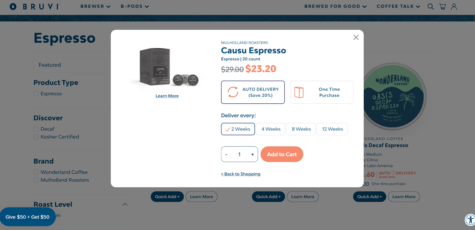
The CTA button should stand out from the rest of the page and be a different color than any other buttons on your site. This is a great way to draw attention to it and make sure users don’t miss it. If you want to elevate your checkout process and help users to checkout quickly then what better way to add some colors into your website’s navigation. Bruvi-one of the brand’s for selling coffee machines and pods is a good example. They have used orange color in the “Add to Cart” call-to-action button to help users checkout easily.
Make sure it stands out
Unique shapes and/or sizes also ensure that your CTA button stands out to draw attention to it. Let’s take a look at Pot Gang’s Shopify store where people can order plants and grow them themselves. Pot Gang used a different font called “Mouse Memoirs” to help make the CTA look bigger in their product detail page.

Use images to communicate the action
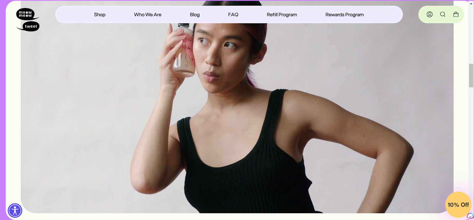
An image of a cart for “Add to Cart” buttons or an image of a person clicking or using the product can be a great way to communicate the action. You may want to check out “MeowMeowtweet” brand -a vegan-based personal care skincare brand as an example. The models are posing with the product to showcase authenticity and help users understand that their products are truly for all skin types.
How to Position Your Call-to-Action Button
After designing your CTA button, it’s time to think about where to place it on your page. Here are some tips for positioning your CTA buttons:
Place it above the fold
Above the fold means that your CTA button is visible without having to scroll down the page. This is important because most users won’t scroll past the fold and you don’t want them to miss out on an opportunity to convert. Phase 3 team created a consistent brand messaging for one of the popular skincare brands “Kinlo” created by Naomi Osaka for Melanin Rich skin tone.

Place it in multiple locations
Placing your CTA button in multiple locations ensures that your visitors will see it no matter where they are on the page. This also helps to reduce friction and make it easier for users to take action. Pipcorn one of the popular snack brands using upcycled Heirloom corn flour used “Add to cart’ on the checkout page and people can easily shop for their products with such easy navigation.

Make sure it’s visible
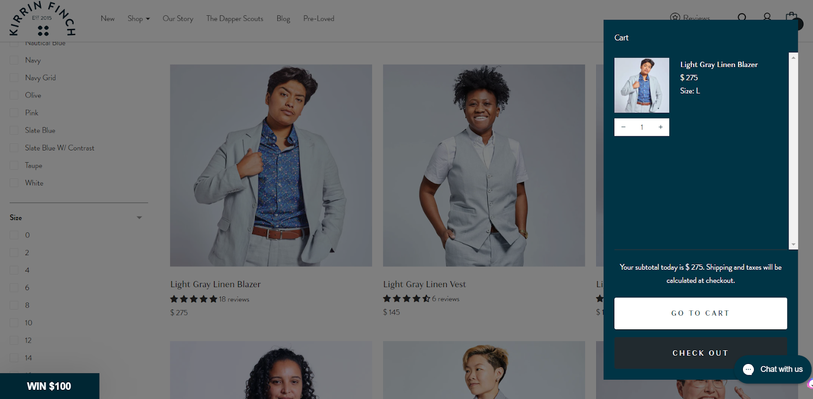
Use color, size, and/or shape to make your CTA button stand out from any other elements on the page so that users can easily spot it. Let’s take a look at Kirrin Finch a brand focussing on selling apparel for nonbinary bodies and females. The checkout page as well as the CTA “ Go to Cart” stand out from the rest of the store due to the great user experience and a user can easily select the size of their clothes and checkout within a few seconds.
Place it at the end of important content
Make sure your CTA button is placed at the end of important content. This gives visitors time to digest all the information and encourages them to take action when they’re ready.
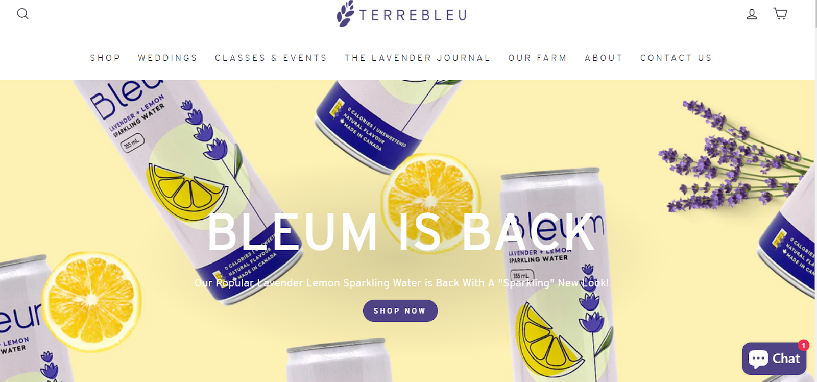
Terry bleu a farm that harvests and sells lavender-based products such as bathing products, essential oils, etc uses “Shop Now” in their main page to make users buy their products easily.
How to Test Your Call-to-Action Buttons
Testing your CTA buttons is essential to make sure that they are optimized for success. Here are some tips for testing your CTA buttons:
- A/B test : A/B testing is a great way to determine which design, position, and copy work best. Set up two versions of the same page and measure the results to see which performs better.
- Split test – Use split testing to compare different elements of the CTA button such as the color, shape, and copy. This will help you determine which version performs best.
- Analyze data – Use analytics tools to track user behavior and analyze the data to see what’s working and what needs improvement.
There are a plethora of tools that can help you to test CTA buttons and we would recommend Hotjar heatmaps to track user behavior on your website and test CTA buttons. Follow this link to find out more tools
Wrapping It Up:
By following these tips, you can ensure your CTA buttons are optimized for success on your Shopify store. Properly designed and positioned CTA buttons can have a major impact on your store’s success, so it’s important to take the time to get them right.
At Phase 3 Shopify Agency, we are experts in helping stores optimize their CTA buttons for success. Our team of experienced professionals has helped hundreds of stores maximize their conversions with optimized CTA buttons. Contact us today to learn more about how we can help you unlock success in your Shopify store.
Optimizing CTA buttons is an important part of any successful e-commerce strategy. With the right design and position, CTA buttons can effectively increase conversions and maximize sales. By following the tips outlined above, you can make sure your CTA buttons are optimized for success on your Shopify store. With the help of Phase 3 Shopify Agency, you can unlock even more potential from your e-commerce business and reach new heights of success.
Originally published on Phase 3 Shopify Agency. All rights reserved.